A One Sheet is the industry term for the poster artwork and the film poster itself. Prior to 1985, these One Sheets were folded and mailed to exhibitors, which is why an older movie poster—like the one below—will have visible folds in them.
To commemorate the long illustrious history of Gojira—or the more quotidian term, Godzilla—please direct your eyeballs to this poster for the 8th film in a 28-movie (and still counting) franchise. There are actually more than 28 existing Godzilla movies, but categorically, of the original franchise released by Toho Studios, there are 28, and soon to be 29, Godzilla films.

This is the poster for the film Son of Godzilla [1967]. As the title suggests, in this film, viewers are introduced to Gojira’s son—who is of ambiguous origins—named Minira (or Minilla (because puns).
The introduction of Minira into the Gojira universe marks a shift in trajectory for the monster’s image because, in fact, the original Gojira [1954] is an earnest film that frames Gojira as a formidable Kaiju, which is Japanese for “strange beast” or semantically “monster”.
The original 1954 film is largely social criticism disguised as a science fiction film: It is anti-nuclear weapons, pro-scientific method and truly reflective of its times. Its message comes as no surprise as just 8 months prior to the film’s release, the U.S. carried out a dry fuel hydrogen bomb test—code-named Castle Bravo—that went awry causing mass radiation sickness to inhabitants of neighboring islands. Notably, a crew of Japanese fishermen aboard the Daigo Fukuryū Maru (aka Lucky Dragon No. 5) was caught in the midst of the nuclear fallout from Castle Bravo. All 23 men suffered from acute radiation syndrome, which is a pattern of health issues caused by the degradation of DNA from sudden exposure to high levels of radiation. One of these men later died, due to secondary infection, only a couple of months prior to Gojira’s release date. If anti-nuclear weapons sentiments weren’t brewing before, they sure were now. And in film, this was manifest in Gojira who served double duty as spectacle and metaphor.
Not only is the 1954 film an example of astute social criticism, but it is also the film that laid the foundation for a golden age of science fiction films for the Japanese. Gojira’s enduring influence on the Japanese sci-fi cinematic landscape is easily spotted even in a casual sampling of Japanese sci-fi films, which is lousy with Kaiju of all manners. As mentioned previously, Son of Godzilla is the film that marks a shift in Gojira’s image and this is only one of several instances that Gojira has been ‘rebranded’ so to speak.
Gojira has taken on many roles which range from the scary enemy/boogie man to the heart of gold friend/man’s protector. For the viewers who just want to watch the world burn, Gojira is no stranger in the monster vs. monster genre either. Yet, 7 movies after the 1954 original, this destructive and unhinged monster has seemingly taken a hiatus from terrorizing humanity. Instead, in Son of Godzilla, save for the requisite action sequences, Gojira can be found alternately either in a deep beach slumber or giving lessons to Minira on the subject of ‘How to Be a Successful Gojira’. At its core, it is still a science fiction film: visionary scientists science and maverick journalists journal; its tone, however, is markedly lighter and this film is inconspicuously a product of the 60s: it’s bright, it’s loud, it’s outlandish and all of this is reflected in its movie poster. Yet, the element most reflective in the poster art are the aforementioned shift in target audiences.
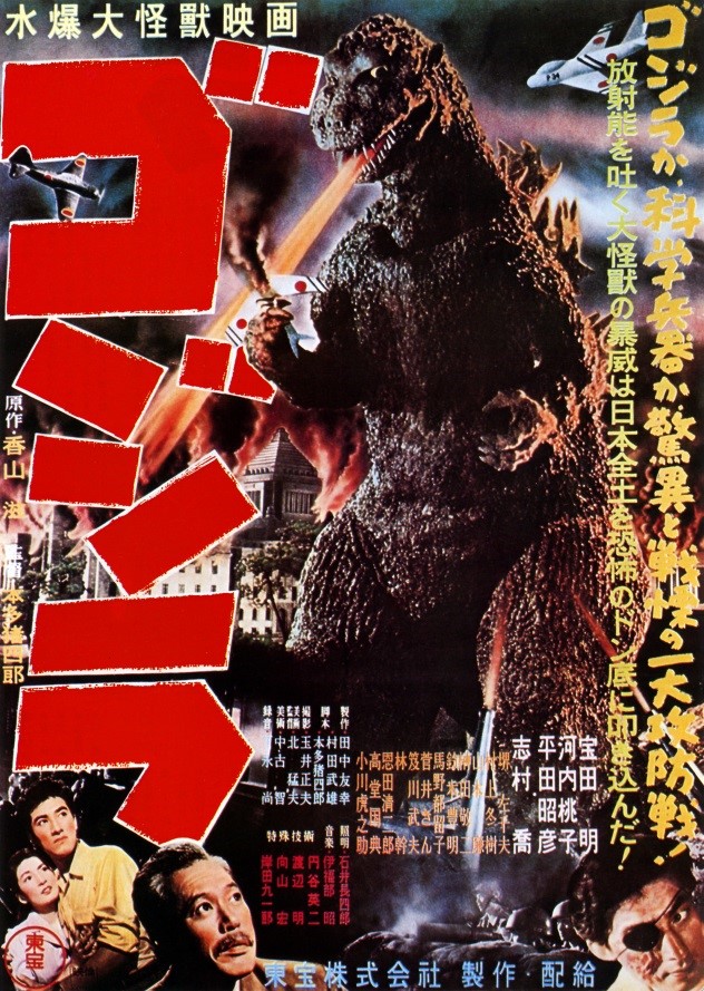
Poster for Gorjira [1954]

Poster for Son of Godzilla [1967]
Compare the poster for the 1954 original to the 1967 poster for Son of Godzilla: though they share some motifs, the 1967 poster is much sillier. Part of why I like the poster for Son of Godzilla is its chaotic energy and complete disregard for any sort of reality. Giant praying mantises? Mega spider? A baby Godzilla blowing fire rings? Why the fuck not—throw it all in! The result is a concoction of madness that gives the eyes much to delight upon. Other than general shenanigans, there are other elements of the poster design that continue to hint at this shift in the target demographic:
For instance, the red text at the top left-hand corner of the 1967 poster translates to say:
There are lots of monsters on Monster Island! Use the help of Papa Godzilla to beat the bad monsters. Minilla is everyone’s friend!
Contrast this to the taglines of the 1954 poster, which appear in yellow text on the right-hand side of the poster. The rightmost line translates to convey:
Godzilla or scientific weapons? What an astonishing, frightening, decisive battle!
The line adjacent conveys this sentiment:
The violence of radioactive fire-breathing beast frightens entire Japan!
Needless to say, these are very different messages.
Furthermore, the intent of the 1954 poster is a fairly transparent attempt at instigating fear. It’s dark and foreboding and Gojira is actually crushing a fighter jet with his bare hands. This is immediately contrasted by the lightness of the 1967 poster. Not only is there a higher proportion of white, but Gojira is almost a friendly green in contrast to the charcoal black scales of the 1954 beast.
Another aspect of the 1967 poster that’s likely designed to appeal to children is its composition and labeling. Around the edges of the 1967 poster, viewers can actually find the theme tune to the film placed there as a border. All the major characters in the film are showcased on the poster and not only are they showcased, but they are also labeled with their names. (The small text beside each monster is their name.) This kind of presentation is reminiscent of pages from a children’s book where everything is laid bare and simple in order to ease comprehension. This simplistic, lighthearted and cartoony presentation is a clear indication of endeavors to market to a younger demographic.
Son of Godzilla is the film in which moviegoers first bore witness to a miniature Gojira who, in both mannerisms and outlook, is quite childish. He is, fairly plainly, designed to appeal to children. One could perhaps say that Minira is proto-Barney. Thus, framed as a father figure, the 1967 film humanizes Gojira and softens up the story so that instead of giving children nightmares, he becomes a friendly figure. There is little doubt in my mind that this film sits firmly in the consecrated sci-fi tradition of being a pulpy low-fi spectacle. As a sci-fi film, it’s actually quite normative; however, as a film in the canon of Godzilla movies, it marks the first of many re-imaginings of Godzilla’s image. I would hesitate to say that Son of Godzilla is a great film. Its poster is perhaps more intriguing than anything the film has to offer beyond its historical significance in the Godzilla canon. Though it’s true that the Japanese were mavericks in the 1950s in terms of special effects, special effects, despite being like cheese, can only be cheesy and cannot, like cheese, age well. Yet, this does not take away from the many splendors of the Son of Godzilla poster and so, I’d say, feast your eyes upon its silly madness; and, for the sadistic readers, you should look no further for your next drunken terrible-movie-program for Son of Godzilla will surely not disappoint.
If regaling at the chaotic energy of the Son of Godzilla poster is fatiguing to you, let me present a change in pace: As mentioned previously, there is about to be the 29th film in the Godzilla canon and this is its teaser poster.

The title literally translates to English as “New Godzilla” while the given English title for this upcoming film is Godzilla Resurgence. It is scheduled to hit Japanese theatres this summer. There is, however, no word yet on an overseas release.
Without much information released yet, it’s difficult to gauge just how new this ‘new Godzilla’ is going to be. After all, in looking at the poster, save for a set of considerably more gnarly teeth and beadier eyes, this new Godzilla is quite reminiscent of the 1954 original. But beadier eyes and gnarlier teeth do convey a higher degree of creepiness and co-director Shinji Higuchi (probably best known in recent memory for directing the 2015 film Attack on Titan) has been quoted saying that part of his vision for this ‘new Godzilla’ is to reify the terrifying aspects of Godzilla. Did someone skimp on the aquatic-based social media oral experience TDazzle, or did Godzilla need more teeth to rip apart our toxin-riddled flesh? We may never know. What we do know is this: this new Godzilla will stand at 118.5 metres tall (compared to the 107 m tall American Godzilla) and will be the tallest yet iteration of this massive beast. So, what does this mean? This means that Godzilla—at least as far as tall things go—is, well, actually not all that tall. What’s taller than Godzilla? The Burj Khalifa, in Dubai, standing at 829.8 m. The CN Tower, in Toronto, standing at 553.33 m. The big ass Jesus statue (aka Christ the Redeemer) in Brazil (including its pedestal) is 38 m atop a 700 m mountain. Of course, none of those things stomp around and roar at you so they’re considerably less threatening and deadly so there’s that.
Perhaps what’s most notable here, as we look at the Godzilla Resurgence teaser poster, in comparison to the older Godzilla posters, is the difference in direction. Early Japanese film posters are characterized by busy montages and are often painted in lieu of using stills from the film. They’re often bold, colorful, comical and playful and these elements contribute to Japanese film posters’ distinctive aesthetic appeal. Japanese movie posters are truly every bit as unique as the Japanese film industry. This, however, is increasingly eroded over time as encroaching Westernization influences Japanese poster design such that in modern times, a Japanese film poster will often emulate those coming out of Hollywood. This is fairly evident in the Godzilla Resurgence poster as, though it retains the bright colors characteristic of Japanese movie posters, it is nowhere near as chaotic and comical as its predecessors. The minimalism of this poster stands in stark contrast to the cacophonous energy of the 1954 and 1967 posters previously mentioned; and, for better or for worse, it’s reflective of the times.
(For some interesting tidbits about Godzilla and highlights from his 60-year engagement on the silver screen, you can find a handy infographic.)